We’ve all been there – we submit a photo that we took for CC (constructive criticism). Your heart is beating fast, your palms get a little itchy, and a fine sheen of sweat breaks out on your forehead as you wait for what will – inevitably – turn into a bloodbath as people (most of whom you don’t know) rip your photo apart during the image review process.
And this wouldn’t be such a big deal except that this is THE photo.
The photo where the photography gods finally smiled on you and you feel like you totally nailed it.
Have no fear!
In today’s post we are looking at tips we can use to critique your images, as well as (objectively) offer advice on someone else’s photos as well.

Image Review for Photographers
1) Talk about Why the Image Works/Doesn’t Work
When we are looking at images, instead of saying “I like this” or “I don’t like this”, try and switch that statement out with “This image works because…” or “This image does not work because…” and give reasoning behind your opinions. Whether you like or dislike the image has no bearing on whether the image works or not and these phrases take the emotional reaction out of the equation.
This can help you view the photo more objectively, and cause you to look at the strengths and weaknesses in the photo – which will hopefully help you the next time you take photos.
2) Where is the Visual Weight?
What is the first thing that your eye is drawn to in the photo?
When looking at the image, is the subject immediately clear to the viewer or are there too many things distracting the eye? As you are looking at the photo, do you immediately know what the photographer wants you to look at? Without a strong subject, it will leave your viewers floundering around in the image and it will not hold their attention.
So how can you grab (and keep) the viewer engaged with your image:
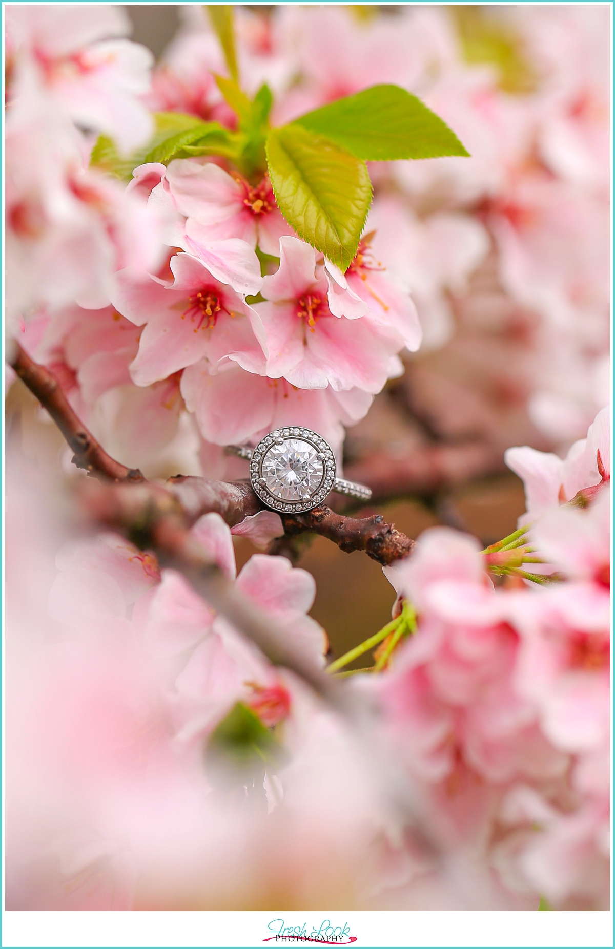
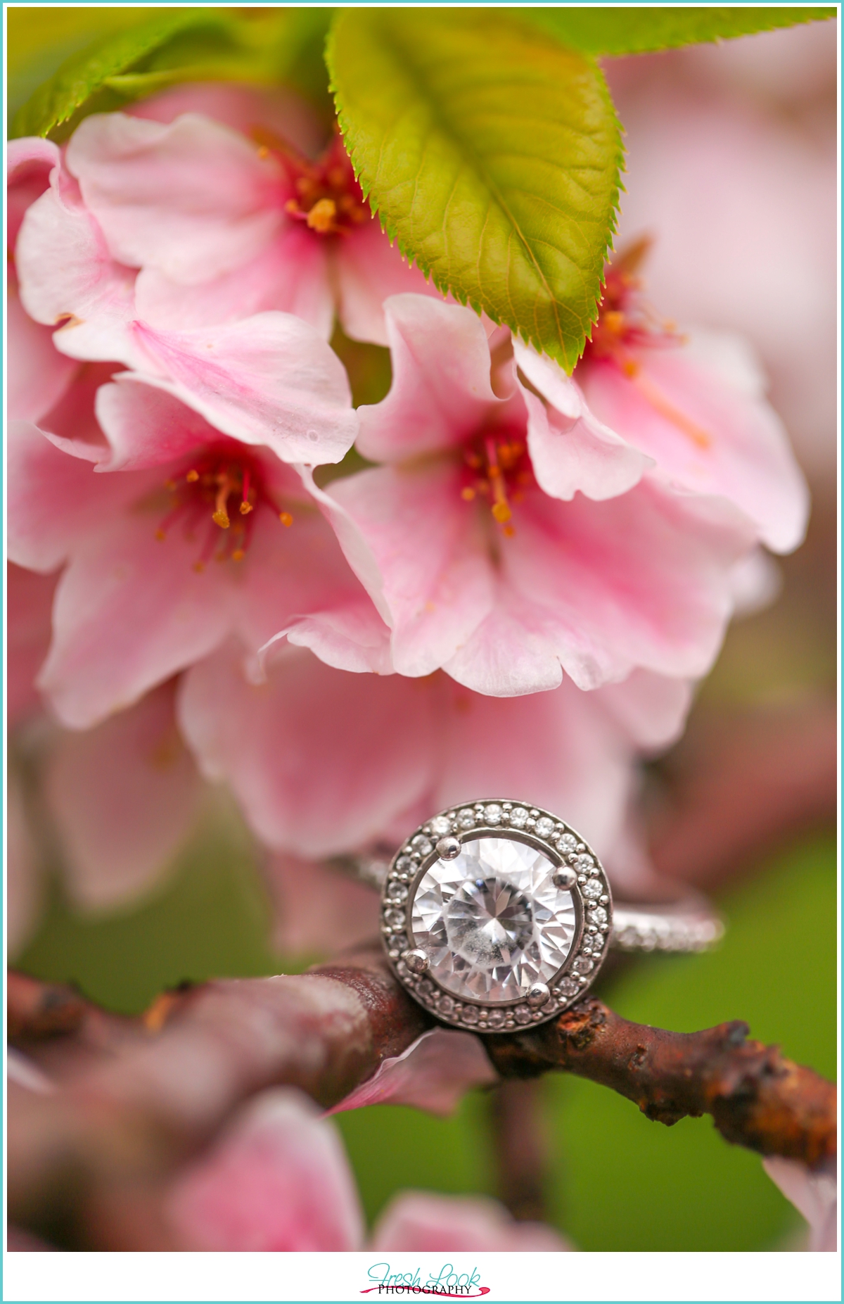
- Shallow depth of field – which makes the background soft and blurry while your subject is sharp.
- Use leading lines to move your viewers eye exactly where you want it in the frame.
- K.I.S.S. – more it not always better, sometimes it’s just more.
- Use directional lighting (such as with an external flash) to place the light exactly where you want it.

3) Light Magic
Lighting can really make or break your image, and does everything to set the tone for your image. Do you want a light, bright and airy feeling? Or do you tend to be more drawn to dark, moody and dramatic photos? Do you want to use Soft Light or Hard Light? There isn’t necessarily a better or worse type of lighting for your images (it’s personal preference really), but really ask yourself this question: Is the light making the image “work”, or does it detract and take away from the image?
4) Color Cast
Are the colors that you see in your image true to life?
Most of the time, when we take photos indoors without a flash, our camera really struggles to get an accurate color temperature (because it’s battling Tungsten lighting) and can cause your photos to look orange and unnatural.
Change the camera’s white balance in order have the correct Kelvin temperature in camera (how your camera looks at the color temperature), you can do this by going to one of the auto white balance modes (Sunny, Cloudy, Tungsten, etc) or changing it to the specific Kelvin temperature (probably aound 3500 Kelvin).

5) It’s All In The Details
Take a look around your subject, at the edges of your photo, in the background… are there elements that don’t contribute to the story you are trying to tell? Or elements that distract from the story? Are you using the rule of thirds and making the composition pleasing to the eye?
Don’t be afraid to crop in closer to eliminate distractions and place your viewers eye right where you want it!
There You Have It, Our Top 5 Tips for Image Review!
If you’re looking for a more in-depth image review or another set of eyes to look at your photos, I’d love to help you out! We offer mentoring for photographers, you can learn more about that via THIS LINK, or simply hit the { CONTACT ME } button and drop me a line to let me know what’s on your mind!


